Color is one of the first things people notice in a design—and one of the most powerful tools a graphic designer can use. Whether you’re crafting a brand identity, a user interface, or a social media post, understanding color theory will elevate your work from good to unforgettable.
Let’s explore what color theory is, how it works, and how you can master it to communicate emotion, build hierarchy, and guide user behavior like a pro.
🧠 What Is Color Theory?

Color theory is the science and art of using color. It explains how humans perceive color, how colors mix, and how they contrast or harmonize with each other. Rooted in centuries of artistic tradition, modern color theory gives graphic designers a reliable framework to create visually appealing and emotionally resonant work
🔺 The Color Wheel: Your Design Compass
The color wheel is the foundational tool of color theory. It organizes hues in a circle to show relationships between them.
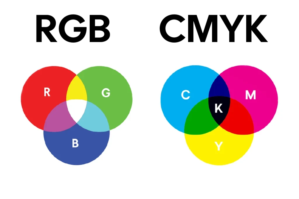
1. Primary Colors
- Red, Blue, Yellow
These are the base colors that can’t be created by mixing other colors.
2. Secondary Colors
- Green, Orange, Purple
Made by mixing two primary colors.
3. Tertiary Colors
- Red-orange, blue-green, etc.
Made by mixing a primary and a secondary color.
🎯 Color Harmonies: Creating Balance
Color harmony is about combining colors in ways that are pleasing to the eye. Here are the main types:
Complementary
Colors opposite each other on the wheel (e.g., blue and orange). High contrast and energy.
Analogous
Colors next to each other on the wheel (e.g., blue, teal, green). Calming and cohesive.
Triadic
Three colors evenly spaced on the wheel (e.g., red, yellow, blue). Balanced yet vibrant.
Monochromatic
Different shades and tints of a single hue. Elegant and minimal.
Please check also some design here : https://dribbble.com/amanur
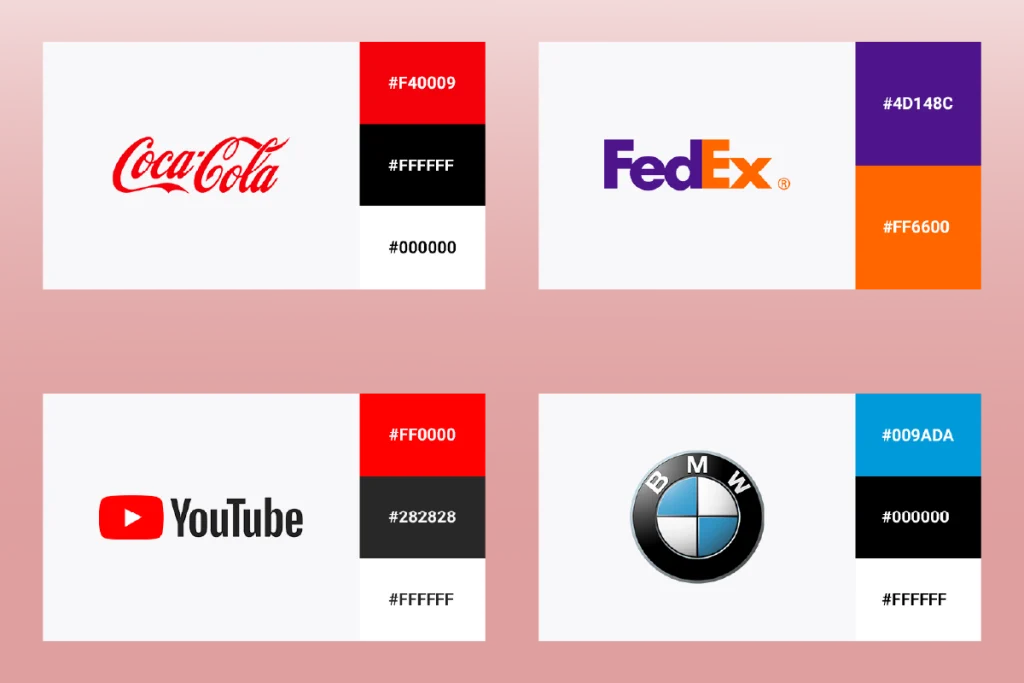
📐 Color in Branding
Brands often stick to strict color guidelines because color plays a huge role in identity and recognition.
Think:
- Coca-Cola = Red
- Facebook = Blue
- Spotify = Green
Consistent color use across platforms increases trust and memorability.
🧠 The Psychology of Color
Colors evoke emotions and associations—consciously or subconsciously.
| Color | Emotions & Associations | Design Use |
|---|---|---|
| Red | Passion, urgency, excitement | Sale banners, call-to-action |
| Blue | Trust, calm, professionalism | Finance, healthcare |
| Yellow | Optimism, energy, creativity | Startups, children’s brands |
| Green | Growth, nature, health | Sustainability, wellness |
| Purple | Luxury, creativity, mystery | Beauty, high-end products |
| Black | Sophistication, power, formality | Fashion, luxury |
| White | Cleanliness, simplicity, purity | Tech, minimalism |
📱 Color in User Experience (UX)
In UX/UI design, color does more than beautify—it informs and guides:
- Contrast improves readability and accessibility.
- Color-coded elements enhance navigation (e.g., green = success, red = error).
- CTA buttons often use high-contrast colors like red or orange to stand out.

🧩 Practical Tips for Designers
- Start with a mood: What do you want your audience to feel?
- Use color palettes: Tools like Coolors or Adobe Color can help.
- Stick to 2-3 main colors: Avoid overwhelming the viewer.
- Check accessibility: Use tools like Contrast Checker to ensure your design is readable for all users.
- Stay consistent: In branding, consistency is key for recognition.
💬 Final Thoughts
Color theory is where art meets strategy. By mastering the principles of color, you’re not just decorating—you’re communicating. Whether you’re trying to calm, energize, or persuade your audience, color is one of your most powerful tools.
So the next time you pick a palette, don’t just go with what “looks good”—think about what it says.

One Comment